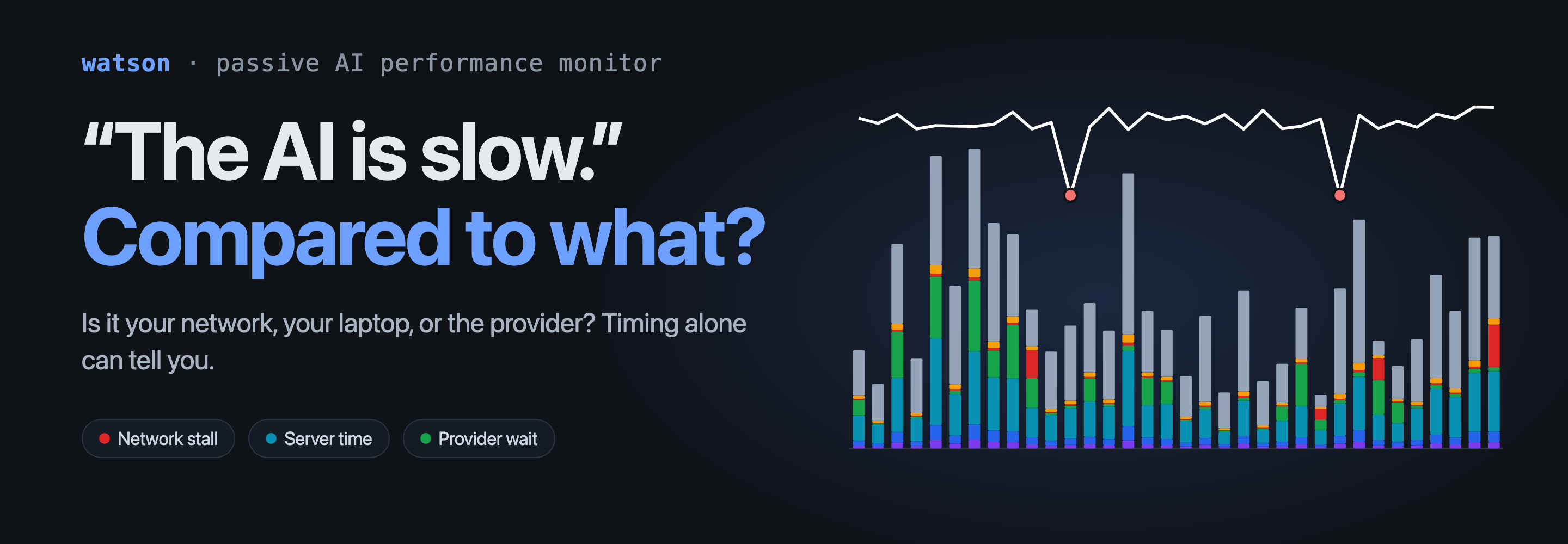
You’re mid-task in an AI coding assistant. You send a request. Nothing happens for eight seconds, then text pours out, then it freezes for four, then finishes. Was that your Wi-Fi? Your VPN? The provider having a bad afternoon? A tool the assistant was running on your own machine? Or just a long answer?
From the chair, they all feel the same, and none of the usual tools can tell them apart.
Why the usual answers don’t work
Ping and round-trip time only tell you about the network. A connection can have a perfect 20 ms RTT while the provider takes eight seconds to start answering, so RTT alone can’t separate “my network is slow” from “their service is slow”.
Browser dev tools are great, but only for AI in a browser, and only if you happen to have them open. A growing share of AI use isn’t in a browser at all: Claude Code, Codex, the desktop chat apps, Copilot inside an editor. Native apps have no dev tools panel, and they keep their timing to themselves.
Decrypting the traffic with a local proxy and your own certificate authority would show everything, but it means installing a root certificate and reading prompts and answers. I didn’t want to make that trade for a tool that runs all day, on a work machine, with admin rights.
The bet: timing is enough
The idea behind watson is that you don’t need the content to know how a response behaved. Encrypted traffic still has a shape: when your request left, how long until the first byte came back, how steadily the answer streamed, where it paused, whether packets were being resent while it did.
So watson watches packet timing and sizes. The only thing it reads from the application layer is the server name in the TLS handshake, so it knows which service a connection talks to. It never decrypts or stores content, and nothing leaves the machine. Packet capture needs elevated privileges, and that promise is what makes it acceptable to grant them, so I wrote it down as a design rule and treat anything that would break it as out of scope. Browsers were the one place the rule cost me something; more on them below.
From there it does what a person staring at a packet trace would do, automatically:
- finds each interaction (one request and its streamed response) from timing alone;
- measures time to first byte, how long the response took, and how much of the delay was connection setup;
- explains each pause longer than a second. If packets were being retransmitted or round-trip time spiked, it was the network. If your CPU was saturated, it was your machine. If nothing else was going on, it was the provider working, and that one is reported but never held against the network.
I care most about that last rule. A tool that blames the network every time an answer is slow is worse than no tool, because it sends you off to fix the wrong thing.
Browsers: the hard case
A browser is the worst thing to watch from the wire. Every web app, every tab and every extension shares one process, so “which connection was Claude?” has no answer from the process table. And most browsers speak HTTP/3 (QUIC), which encrypts the transport headers too, so there are no retransmits or round trips to read. Worse, when I looked at a real Claude session in Chrome, passive capture had split one 32-second stream with pauses into three separate pieces. It could not even say how many responses it had seen.
The fix needed a better vantage point: the page itself, which sees each chunk of a streamed answer arrive. So watson has an optional Chrome extension, and it carries a narrower version of the same promise. It records when each chunk arrived and how many bytes it was, and nothing else. It never sends response text, prompts, headers or URLs, and a test fails if any of those ever reach its outgoing payload. That covers streamed fetches, the older XMLHttpRequest style Gemini uses, and WebSockets, which is how Copilot chats. A socket stays open across turns, and the usual trick of watching for a “done” marker would mean reading the content, so I cut turns by timing alone: a turn starts when the page sends and ends at the next send, the close, or fifteen quiet seconds. The extension talks only to watson serve on your own machine, with a secret you paste in once, and it watches only the domains in watson’s registry. I wrote it up as its own decision. It’s a real exception to “never read the content”, and I’d rather it be argued with in the open than have it slip in unnoticed.
The page knows exactly when the first byte, the last byte and each pause happened. Capture knows what the page cannot: retransmits and round-trip time, which are what tell a network stall from a provider wait. watson takes the page’s report as the interaction and attaches the capture’s evidence from the connections that overlap it. A row shows up as “Claude web”, not “Chrome”.
When capture has nothing to add, the row says so. Over QUIC, or on a connection that was already open when watson started, you get the page’s exact timing and no network health, so the score comes from the first byte alone. It is drawn as 100~ and marked browser-only, and the reason names the protocol. I would rather show a weaker score that looks weaker than a confident one that is guessing.
Being honest about what it can’t know
Inference has limits, and I tried to make the tool admit them. Every number carries how it was obtained: read directly from TCP state, inferred from timing, or not observable at all. QUIC traffic hides the connection’s health, so a pause there is labelled “unattributed” rather than guessed at. A score comes with a confidence rating and the reasons it is low. And what each interaction is judged against is your own history with that service, not a made-up threshold.
It also can’t see tokens, model names, or what you asked, and that holds for the extension too. One consequence: it cannot tell a model that is thinking from a stream that has stalled, because that needs reading the events. So for browser streams the pauses are recorded and shown, but they don’t move the score, since counting them would rate every thinking pause as a fault. I think that’s the right place to stop.
What it looks like now
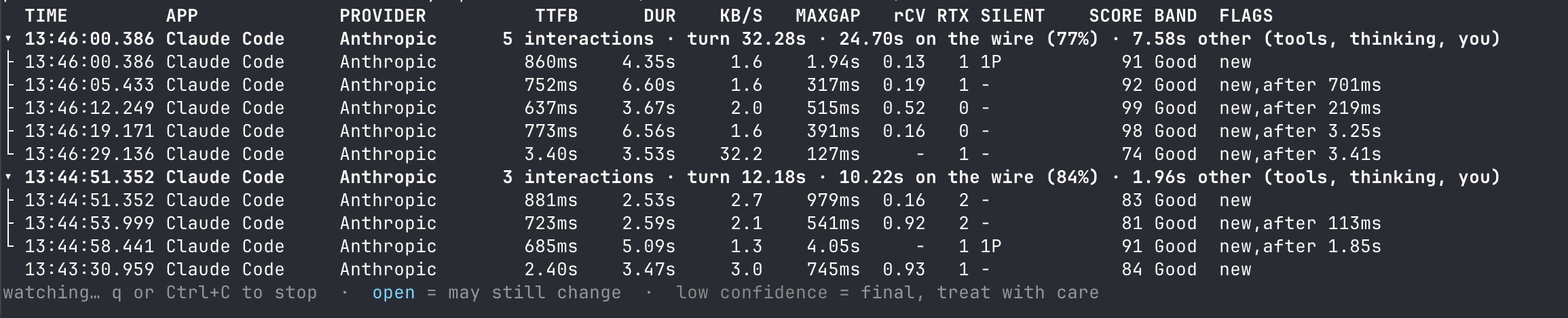
You run watson watch in one terminal and it prints a row per AI response: time to first byte, duration, pauses, and a 0 to 100 transport score. Interactions are grouped into turns, so you can see how long a single “waiting on the AI” episode took and how much of it was actually on the wire.
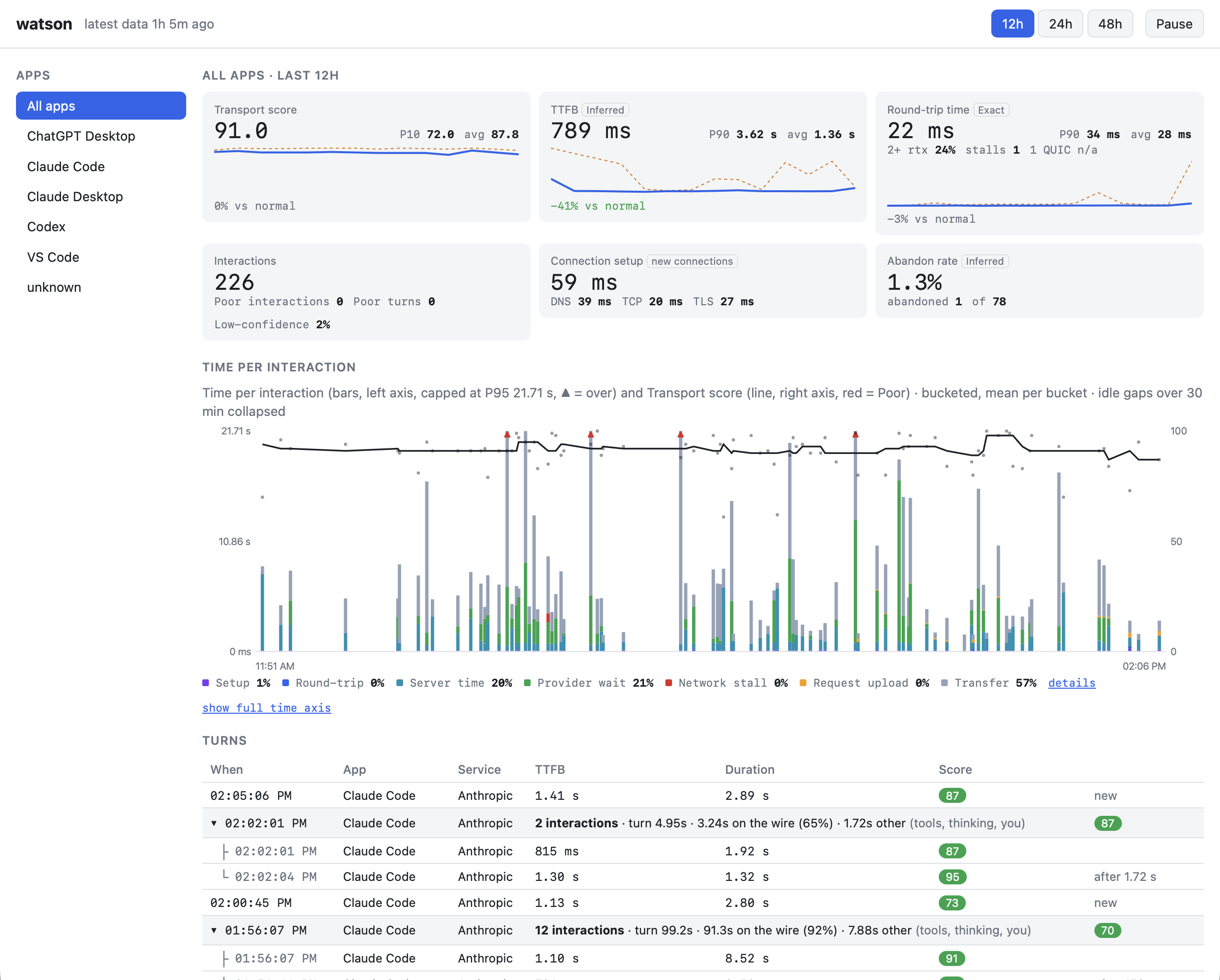
In another terminal, watson serve opens a live page: a tile per metric against what’s normal for you, and a chart of every interaction’s time broken into setup, round-trip, server time, provider wait, network stall and transfer, with the score drawn over it. You can pick one app or all of them, over the last 12, 24 or 48 hours. Web chats on Claude, ChatGPT, Gemini and Copilot appear in the same list, next to the native apps.
What I got wrong, and what I’d do differently
I blamed the network first. When a session feels slow, the Wi-Fi is the obvious suspect. The data disagreed: across two days and about 960 interactions, the median round trip was 23 ms, and only 7 interactions had a network stall. (These numbers are from native apps; the browser path is newer and I have fewer sessions on it.)
A lot of the wait wasn’t mine to fix at all. Provider wait, where nothing was wrong on my side and the service was simply working, made up about 18% of the time spent inside responses.
Some of the rest wasn’t the network or the provider either. In the turn pictured above, 32 seconds from start to finish, 24.7 were on the wire and 7.6 were “other”: tools running on my machine, the model thinking before it sent, and me.
So when a session feels slow, I now ask the same questions in the same order:
- Is the network unhealthy? High round-trip time, packets being resent, or a pause that lines up with a retransmit means it’s mine to fix: switch networks, check the VPN, move closer to the router. This is the only case where the fix is a network fix.
- Is the network fine but the service slow? A long time to first byte or a long provider wait on a healthy connection means the delay is on their side. There is nothing to fix locally. I retry later, ask for something smaller, or try another model. Most importantly, I stop restarting my Wi-Fi.
- Are both fine and it still feels slow? Then the time is going to what watson calls “other time”, which comes down to how I’m using the tool. A turn full of tool calls, or a very long conversation, costs time that no network can explain. This is where I’d suspect my context window or the shape of the task, and break the work into smaller steps or start a fresh session.
I also got a few things wrong while building it, mostly by trusting numbers that looked right. My first chart of where time goes stacked the median of several unrelated measurements, which added up to something that looked authoritative and meant nothing, so I rebuilt it from parts that really sum to the interaction’s duration. A “throughput” tile turned out to mostly measure how fast the model types, not how fast the network is, so I replaced it with round-trip health. And a chart I had declared finished was completely blank in a real browser because of one unquoted attribute; it passed every check that read the page’s text. I now render and look.
Why bother generalizing
Streaming AI is the case that made the problem obvious, but the same question comes up for every desktop app: file sync that feels stuck, a softphone that cuts out, a remote desktop that lags. Each needs different metrics, because users feel different things. So the next step is a small set of profiles (request/response, bulk transfer, real-time media, remote session, push, AI streaming), each deciding which measurements apply and how they’re scored, so different kinds of app don’t get blended into one meaningless number.
There is also a write-up of watson at watson: Why Is the AI Slow?.